Top Sherwin-Williams Color Combinations to Elevate Your Home’s Aesthetic
Blog post description.
9/9/20243 min read
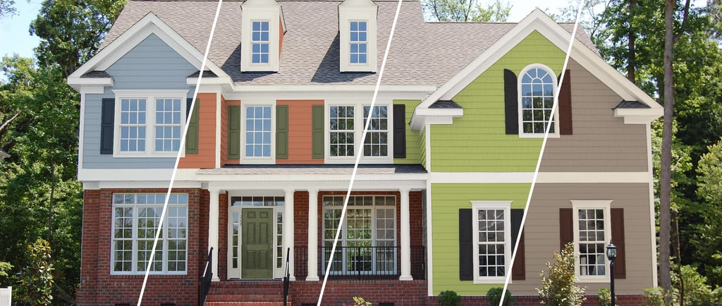

When it comes to creating a captivating and cohesive interior or exterior space, choosing the right color combinations is key. Sherwin-Williams offers an extensive range of colors that can be combined to create stunning aesthetics for any style of home. Whether you're looking for something bold and modern or soft and timeless, there's a Sherwin-Williams palette perfect for your needs. Let's explore some of the top Sherwin-Williams color combinations and how you can use them to enhance your living spaces.
1. Classic Neutrals with a Modern Twist
Neutrals are a timeless choice for any home, offering versatility and a sense of calm. However, combining classic neutrals with a hint of modern color can make a space feel fresh and contemporary.
Colors to Try:
Repose Gray (SW 7015): A soft, light gray that works as a versatile base.
Accessible Beige (SW 7036): A warm, inviting beige that complements any décor.
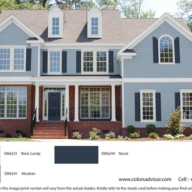
Naval (SW 6244): A bold navy that adds depth and modernity when used as an accent wall or in furnishings.
How to Use: Paint your walls in Repose Gray for a neutral backdrop. Use Accessible Beige for trim and accents to add warmth, and introduce Naval through statement pieces like a sofa, cabinets, or a feature wall. This combination provides a clean and modern look with a hint of elegance.
2. Bold and Dramatic Contrasts
For those who love to make a statement, bold color combinations are a great way to add personality to your home. Sherwin-Williams offers deep, saturated colors that can create drama and interest.
Colors to Try:
Tricorn Black (SW 6258): A rich, true black perfect for accents or doors.
Snowbound (SW 7004): A crisp, clean white that creates striking contrast.
Emerald Green (SW 6717): A vibrant green that adds a pop of color and energy.
How to Use: Use Snowbound as the primary wall color to keep the space bright. Highlight architectural features like doors, window trims, or cabinetry in Tricorn Black. Finally, add a touch of Emerald Green in accessories or a statement wall to bring life and energy to the space.
3. Earthy Tones for a Cozy Atmosphere
Earthy tones are ideal for creating a warm and welcoming atmosphere. These colors evoke a sense of nature and can make any space feel grounded and cozy.
Colors to Try:
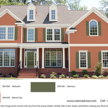
Terracotta (SW 6340): A warm, earthy hue reminiscent of clay and natural landscapes.
Alabaster (SW 7008): A soft, creamy white that balances out deeper shades.
Oakmoss (SW 6180): A deep, muted green that brings a natural element indoors.
How to Use: Start with Alabaster on the walls to create a soft, neutral canvas. Add depth with Terracotta on accent walls or furniture. Incorporate Oakmoss through smaller details like cushions, throws, or a feature wall to create a nature-inspired, tranquil setting.
4. Soft and Serene Blues and Greens
Soft blues and greens are perfect for creating serene and calming environments, especially in bedrooms and bathrooms. These colors work harmoniously together and are perfect for a refreshing, coastal vibe.
Colors to Try:
Sea Salt (SW 6204): A light, airy green with hints of blue that brings tranquility to a room.
Misty (SW 6232): A soft, pale blue that has a calming effect.
Extra White (SW 7006): A clean white that adds brightness and complements the soft hues.
How to Use: Use Sea Salt as the main wall color in living spaces or bathrooms to create a soothing atmosphere. Misty can be used in bedrooms for a relaxed, calming feel. Pair both colors with Extra White trim and ceilings to keep the space feeling fresh and open.
5. Modern Monochromatic Schemes
Monochromatic color schemes are all about using different shades of a single color to create a harmonious look. This approach is simple yet effective in creating sophisticated and cohesive interiors.
Colors to Try:
Mindful Gray (SW 7016): A mid-tone gray that's soft and inviting.
Dorian Gray (SW 7017): A slightly darker gray that adds depth without overpowering the space.
Gauntlet Gray (SW 7019): A deep, charcoal gray that grounds the color palette.
How to Use: Start with Mindful Gray on the walls, then layer in Dorian Gray for cabinetry or furniture pieces. Use Gauntlet Gray for statement walls, doors, or accessories to add contrast and depth. The result is a modern, sleek interior that feels cohesive and thoughtfully designed.
Tips for Choosing the Right Sherwin-Williams Color Combinations:
Consider Your Space: Think about the natural light, room size, and existing elements like flooring and furniture when choosing your colors.
Use the 60-30-10 Rule: Balance your color palette with 60% of the dominant color, 30% of a secondary color, and 10% of an accent color.
Test Before You Commit: Always test paint samples in your space. Colors can look different based on lighting and room conditions.
Use Color Tools: Sherwin-Williams provides online tools and apps to help you visualize colors in your space, making it easier to decide.
Conclusion
Choosing the right color combinations for your home can transform your space and reflect your personal style. Whether you prefer neutral palettes or bold statements, Sherwin-Williams has a wide range of colors to suit every taste. Start exploring these combinations and create a home that truly feels like you!
