Back to gallery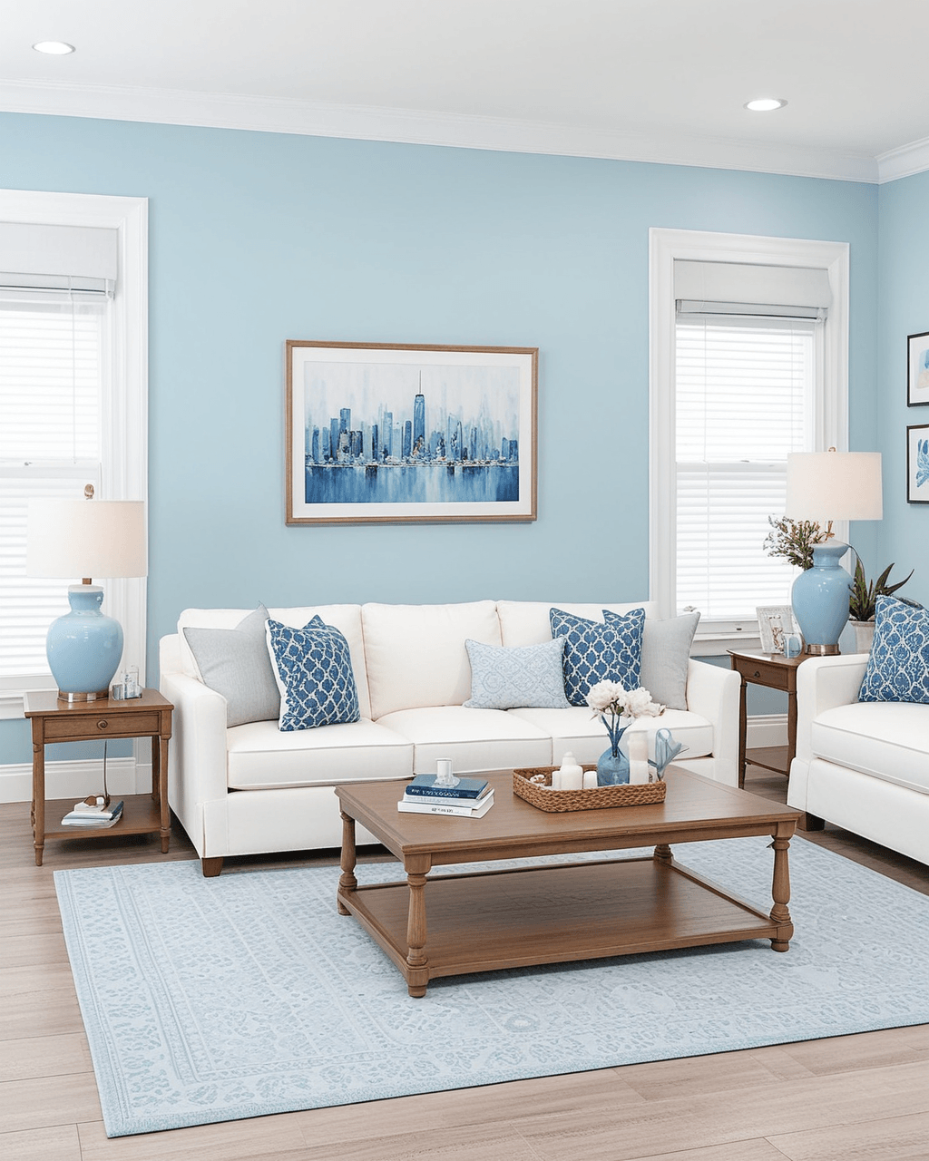
Interior
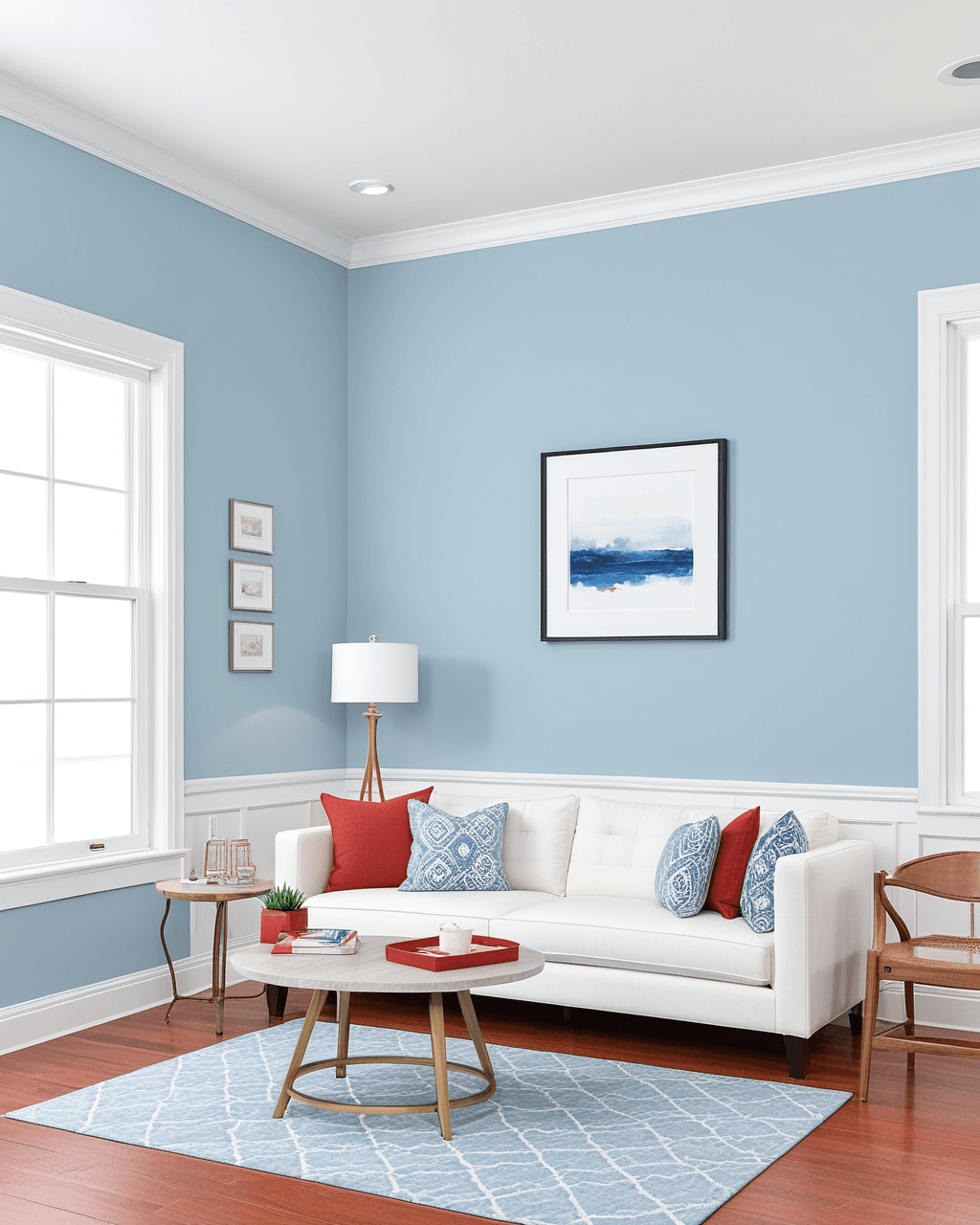
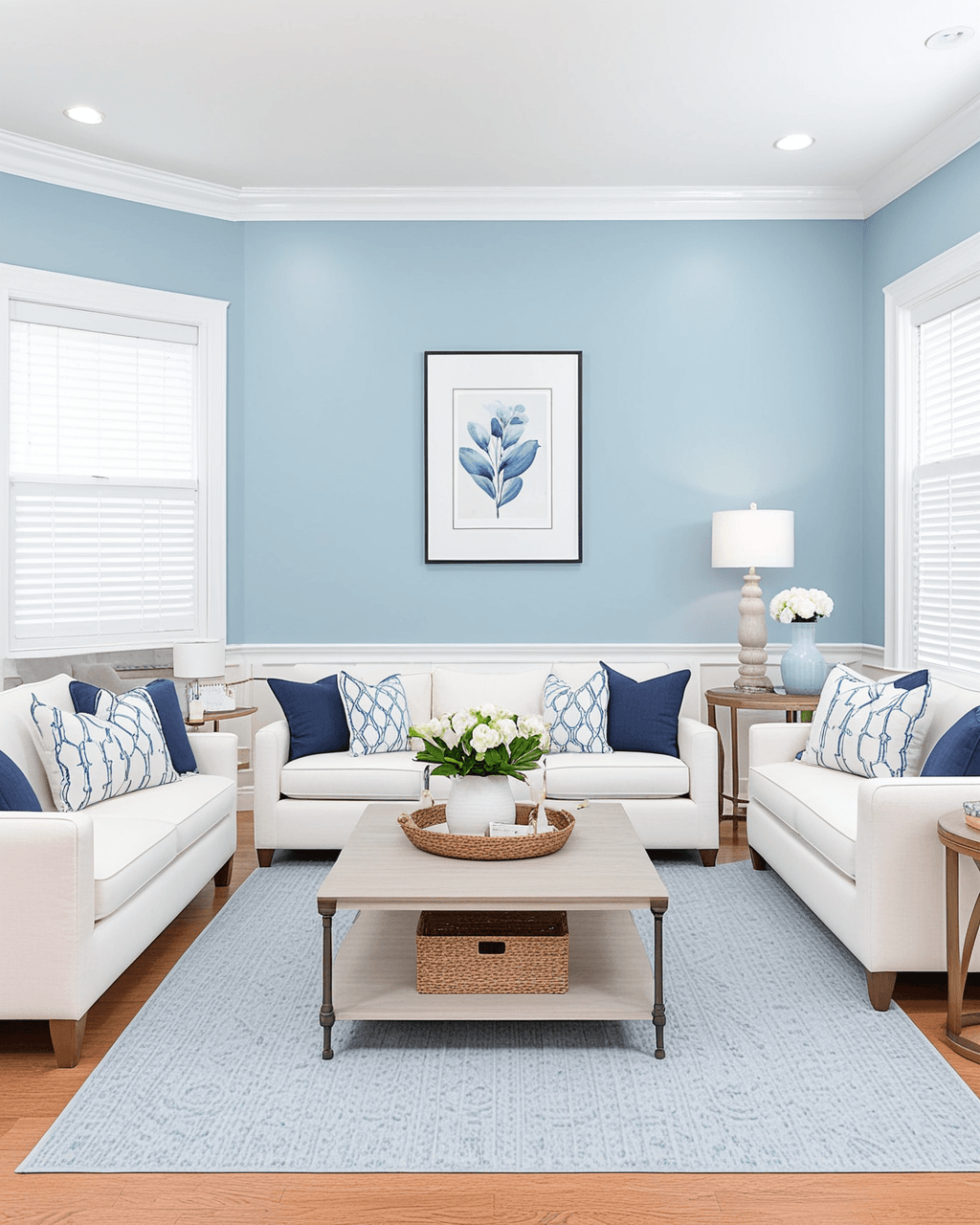
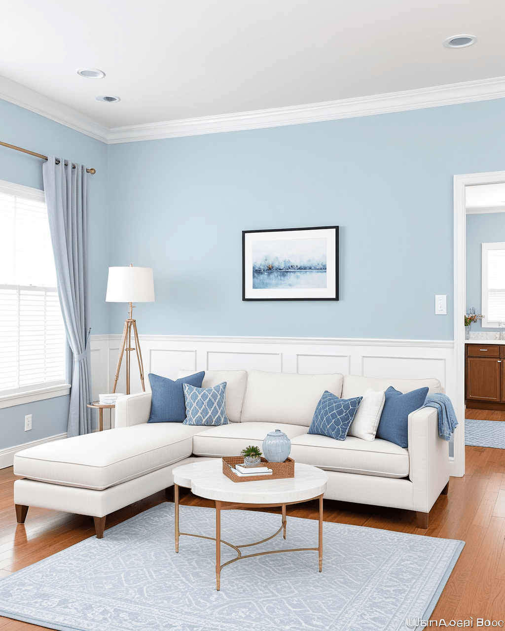
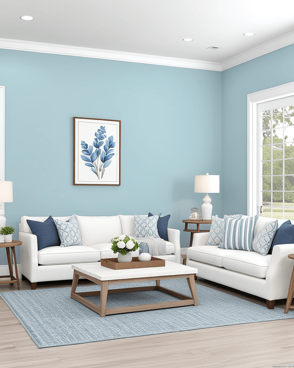
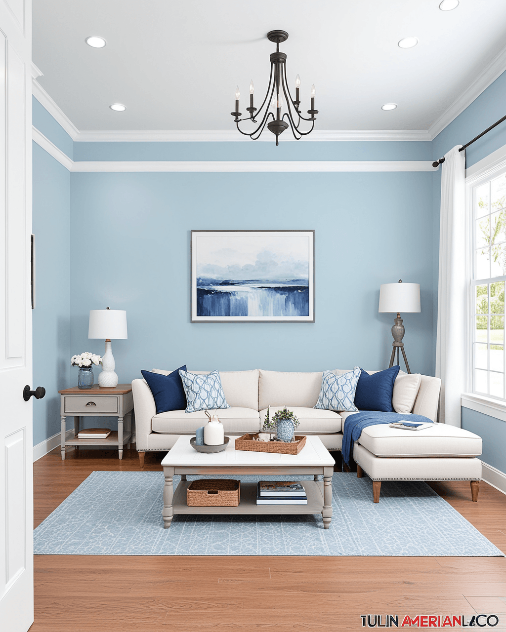
Living Room · Pastel
Paint matches
Paint company
Sherwin-Williams
Wondrous Blue
SW6807#B8CDDD
From palette #BCD1D8
Sherwin-Williams
Extra White
SW7006#EEEFEA
From palette #EAECEF
About this color scheme
This pastel interior color scheme is styled for a living room, with paint matches across Sherwin-Williams, Benjamin Moore, Behr, and PPG. Key shades include Wondrous Blue, Extra White. Use the combination code to reopen exact hex slots in Color Finder or your colorsadvisor workflow. Light and airy for bright interiors and coastal markets — keep trim white and add depth with slightly darker floors or counters. Ideal when you want a pastel mood without guessing catalog codes — each swatch shows name, product code, and nearest brand equivalents.
Similar color combinations
Combination code
SW~#BCD1D8~#EAECEF